Kate Novozhilova
How to write newsletters for e-commerce
In this article we will discuss the basic rules for text in e-commerce newsletters and share two possible methods of creating emails. Let’s roll!
What is e-commerce
Е-commerce is a wide field of Internet sales. Here we sell not only goods, but also services and amenities of all kinds. Online-shops, marketplaces, beauty salons, App Store, PayPal and even GrubHub — all these are e-commerce parts.
Types of e-commerce
B2C: when we sell something to ordinary buyers like you and I
B2B: when we sell something to a company or another business
Here we’ll discuss B2C, but the general rules of a good commercial text work the same for everyone.
Basic rules of text in e-commerce newsletters
One letter — one goal

You come to a viewer, look deep into his eyes, take him by the hand and say: "Let's go. I’ll show you something". And then you lead him straight to your offer or product — without being distracted by anything else.

Imagine a friend telling you a story. But he constantly interrupts to show you his savings in TikTok, shouts to order another glass of wine and flirting with another tablet at the same time. Are you sure you’ll remember his story? It’s the same with newsletters: don’t get distracted and don’t distract the reader.
Put important message to the beginning

Everyone knows that you are here to sell. So do not hesitate and «kick the door out» with your offer. Emphasize it right in a topic of the letter and then amplify it on a banner.

Not everyone reads newsletters in full, so your goal is to make an offer notable even while cursory reading.
Use plain language

It is worth saying that the basic attention of the human mind has a feature described and studied back in the 60s of the twentieth century, on which a variety of tests were done, which made it clear that it correlates… You got it? We didn’t, TBH.

Write it clearer — as if you write for a friend or for your dad who definitely doesn’t know how to enter a promo code to get a discount. Even if your letter is read fluently, a reader’s brain will still catch the important things if you write it in plain language.
CTA is a must-have

According to statistics, CTA (call to action) effectively increases click and conversion rates. Do not resist the statistics in the buttons too: «Buy» and «Add to cart» are still working.

To put it «in a humane way»: recipients don’t read your emails to the letter. Imagine, your entire text is blurred: only the banner, products and buttons are visible. So, buttons should contain an understandable CTA. So that a recipient doesn’t unravel all your «Oop!», «Click» and «Smash» — he should immediately understand what will happen when he makes a «Click» on the button.
Methods
You can attract readers and sell them stuff using different methods. But there are only two basic ones — emails with a lot of text and a little text. Each one works well for their individual goals and audiences. Let’s see.
Show me that face

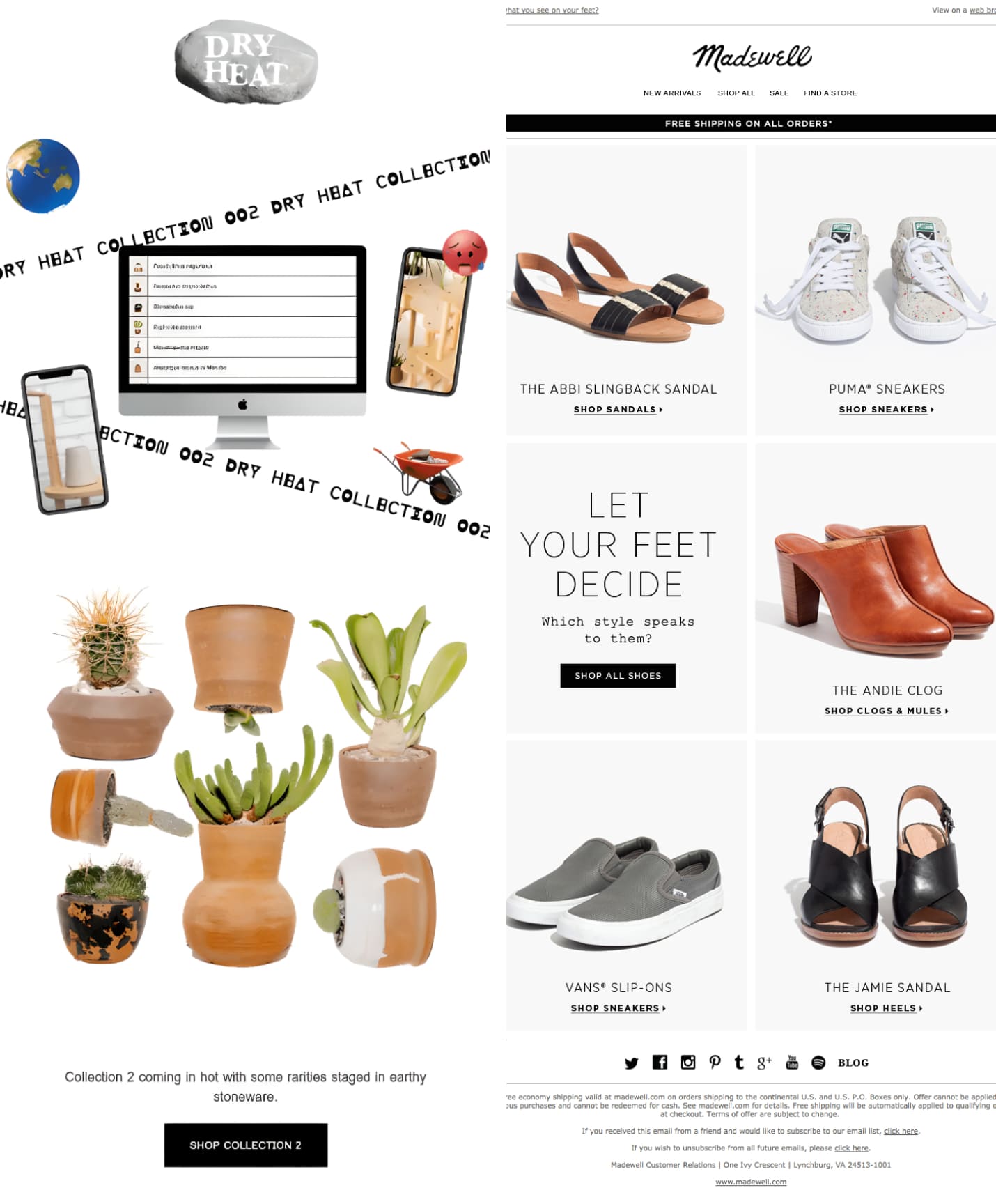
When there’s just a couple of sentences in an email — all the emphasis is on the product, illustrations and the main offer.

The method works if the target audience knows your brand. And especially if they trust you. The advantage of the method is that the reader’s attention is not scattered, but focused only on important things: a discount, a product, CTA and purchase.

The downside is that such letters can become faceless if you don’t use a creative approach in design. Everything that doesn’t pop out or catch an eye is quickly forgotten by the audience. So it doesn’t help with brand promotion.
Let's discuss it anyway

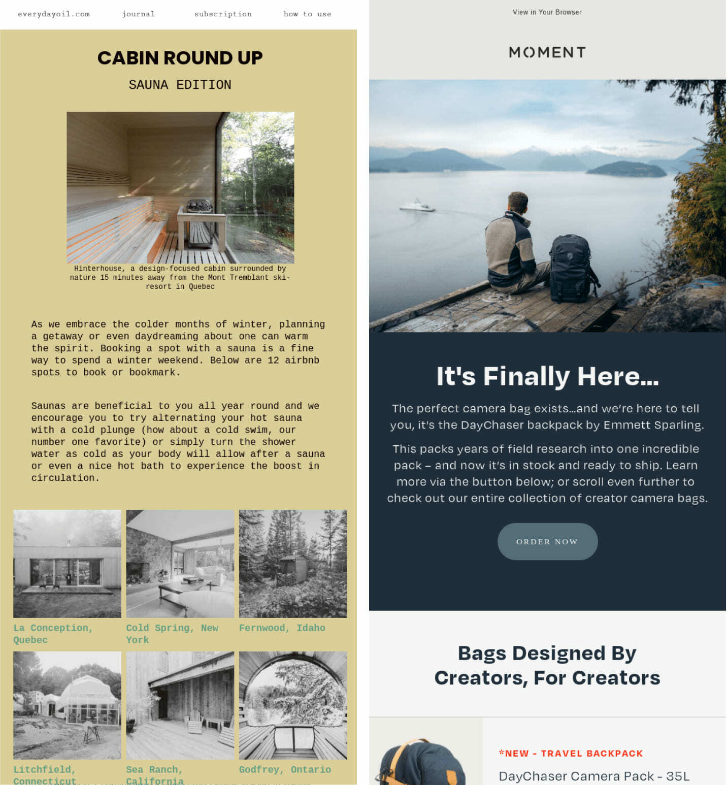
A pure heaven heaven for a сopywriter. There’s a lot of text blocks in such letters, and the letters themselves are large.

This method works if you need to introduce a product. But even in this case, it is important to follow the basic commercial text rules: tell about the important things at the beginning, use plain language and make CTAs.

This also works well in emails where it is necessary to arouse the user’s trust (in real estate field, for example) or where it is important to immerse the reader in the context sensually (perfumes, luxury services and goods).
Summing up
All in all, it’s up to you target audience and statistics to decide how to write or which method is the best. But if you feel that it’s better to shorten or expand the text — do it. And then throw statistics at the resisting ones

The main thing is not to violate the general rules of the commercial texts, so that your letter is read and understood.

Content Oriented Web
Make great presentations, longreads, and landing pages, as well as photo stories, blogs, lookbooks, and all other kinds of content oriented projects.

Content Oriented Web
Make great presentations, longreads, and landing pages, as well as photo stories, blogs, lookbooks, and all other kinds of content oriented projects.

Content Oriented Web
Make great presentations, longreads, and landing pages, as well as photo stories, blogs, lookbooks, and all other kinds of content oriented projects.
Site sections


